interfaces
Sensing everything
On 16, May 2012 | No Comments | In gesture, interfaces | By Dave
Presented at CHI 2012, Touché is a capacitive system for pervasive, continuous sensing. Among other amazing capabilities, it can accurately sense gestures a user makes on his own body. “It is conceivable that one day mobile devices could have no screens or buttons, and rely exclusively on the body as the input surface.” Touché.
Haptic ambient display for soldiers
On 01, Jul 2011 | No Comments | In interfaces | By Dave
Researchers at the Army Research Office developed a vibrating belt with eight mini actuators — “tactors” — that signify all the cardinal directions. The belt is hooked up to a GPS navigation system, a digital compass and an accelerometer, so the system knows which way a soldier is headed even if he’s lying on his side or on his back.
The tactors vibrate at 250 hertz, which equates to a gentle nudge around the middle. Researchers developed a sort of tactile morse code to signify each direction, helping a soldier determine which way to go, New Scientist explains. A soldier moving in the right direction will feel the proper pattern across the front of his torso. A buzz from the front, side and back tactors means “halt,” a pulsating movement from back to front means “move out,” and so on.
“He imagined and created his own magical world and first built the essential concepts and tools that allowed us all to do the same.”
On 11, May 2011 | No Comments | In history, interfaces, music | By Dave
Max Mathews, electronic music pioneer, has died.
Though computer music is at the edge of the avant-garde today, its roots go back to 1957, when Mathews wrote the first version of “Music,” a program that allowed an IBM 704 mainframe computer to play a 17-second composition. He quickly realized, as he put it in a 1963 article in Science, “There are no theoretical limits to the performance of the computer as a source of musical sounds.”
Rest in peace, Max.
UPDATE: I haven’t updated this blog in a while, and I realized after posting this that my previous post was about the 2010 Modulations concert. Max Mathews played at Modulations too, and that was the last time I saw him.
Luscious surface for DJ performance
On 20, Aug 2010 | No Comments | In interfaces, music | By Dave
Over the last few days this video has been so much bombshell to many of my music-prone friends.
It’s called the Multi-Touch Light Table and it was created by East Bay-based artist/fidget-house DJ Gregory Kaufman. The video is beautifully put together, highlighting the importance of presentation when documenting new ideas.
I really like some of the interaction ideas presented in the video. Others, I’m not so sure about. But that’s all right: the significance of the MTLT is that it’s the first surface-based DJ tool that systematically accounts for the needs of an expert user.
Interestingly, even though it looks futuristic and expensive to us, interfaces like this will eventually be the most accessible artistic tools. Once multi-touch surface are ubiquitous, the easiest way to gain some capability will be to use inexpensive or open-source software. The physical interfaces created for DJing, such as Technics 1200s, are prosthetic objects (as are musical instruments), and will remain more expensive because mechanical contraptions will always be. Now, that isn’t to say that in the future our interfaces won’t evolve to become digital, networked, and multi-touch sensitive, or even that their physicality will be replaced with a digital haptic display. But one of the initial draws of the MTLT—the fact of its perfectly flat, clean interactive surface—seems exotic to us right now, and in the near future it will be default.
Something mashfferent
On 03, Aug 2010 | No Comments | In interfaces | By Dave
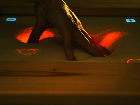
Check out this flexible interface called impress. Flexible displays just look so organic and, well impressive. One day these kinds of surface materials will become viable displays and they’ll mark a milestone in touch computing.
HTC Sense – a powerful unveiling
On 15, Jun 2010 | No Comments | In interfaces | By Dave
I keep watching the HTC Sense unveiling video from Mobile World Congress 2010. The content is pretty cool, but I’m more fascinated by the presentation itself. Chief marketing officer John Wang gives a simply electrifying performance. It almost feels like an Apple keynote.
I felt iFeel_IM
On 10, Jun 2010 | No Comments | In interfaces | By Dave
The iFeel_IM haptic interface has been making rounds on the internet lately. I tried it at CHI 2010 a few weeks ago and liked it a lot. Affective (emotional haptic) interfaces are full of potential. IFeel_IM mashes together three separate innovations:
- Touch feedback in several different places on the body: spine, tummy, waist.
- Touch effects that are generated from emotional language.
- Synchronization to visuals from Second Life
All are very interesting. The spine haptics seemed a stretch to me, but the butterfly-in-the-tummy was surprisingly effective. The hug was good, but a bit sterile. Hug interfaces need nuance to bring them to the next level of realism.
The fact that the feedback is generated from the emotional language of another person seemed to be one of the major challenges—the software is built to extract emotionally-charged sentences using linguistic models. For example, if someone writes “I love you” to you, your the haptic device on your tummy will react by creating a butterflies-like sensation. As an enaction devotee I would rather actuate a hug with a hug sensor. Something about the translation of words to haptics is difficult for me to accept. But it could certainly be a lot of fun in some scenarios!
Thought-to-text
On 06, Jan 2010 | No Comments | In interfaces, transhumanism | By Dave
This is a welcome incremental step towards brain-controlled text input. The other interesting about this experiment is that it was done on people who already had electrodes implanted in their brain to monitor and study their epilepsy. The scientists thought that the electrodes’ output might be able to be controlled with thought, and it turns out it can.
This is very different than the typical brain-computer interface, which uses electroencephalography (EEG). Basically, an EEG is a helmet that oozes tricolor pasta:
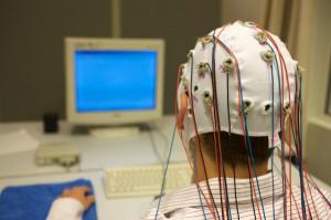
But an eletrocorticograph (ECoG, pronounced “eecog”), like the one used for this experiment, sits on the brain itself, like this:

The Gray Ditz discovers augmented reality
On 04, Dec 2009 | No Comments | In interfaces | By Dave
I must speak up on this one. Recently in the New York Times Sunday magazine, Rob Walker wrote a foolish article about augmented reality. The first half deals with introducing augmented reality, the Avatar movie, and the Yelp app. But this is his description of the future of this incredible technology:
Core77, the online design magazine, suggested one amusing possibility earlier this year: fold in facial-recognition technology and you could point your phone at Bob from accounting, whose visage is now “augmented” with the information that he has a gay son and drinks Hoegaarden. More recently, a Swedish company has publicized a prototype app that would in fact augment the image of Bob (or whomever) with information from his social-networking profiles — and they aren’t kidding.
Your silly example wrecks the already floundering article, whose original purpose, I assume, was to inform us about an incoming technology. So how and why did you come up with the idea that Bob would be marked with a note saying his son is gay? It implies that augmented reality entails a violation of privacy, which it does not.
How about: “Fold in facial-recognition technology and you could point your phone at Bob from accounting and see him enwrapped in a digital ecosystem—video tattoos bloom across his body like Ray Bradbury’s Illustrated Man, while around his head swirls a halo of tweets, emotions, and memories. It may all be virtual, but the way you see him is augmented in a very real way.”
But instead of offering a creative example to show that the possibilities are endless, you make up an offensive scenario and then sarcastically write “they aren’t kidding,” which subtly attributes your idea to the people who are developing augmented reality. It’s dishonest.
If this sounds off-putting, it’s worth noting that most assessments of the augmented-reality trend include the speculation that the hype will fade.
So you’re trying to put us off to augmented reality, and then reassure us that we have nothing to worry about since it won’t happen anyway. Then why write about this topic in the first place? If it’s not news, and it’s not interesting, what’s the point? And, “most assessments” is weasely. If you’ve got the goods, link to them, or at least name your sources.
…Why just look at a restaurant, a colleague or the “Mona Lisa,” when you can you can “augment” them all?
The scare quotes around the word ‘augment’ make it sound like you’re uncomfortable with using the word; as if it’s jargon. Expand your horizons! You don’t need to use quotes every time you learn a new word!
I don’t mean to pick you, NYT, but your articles about new technologies are sometimes rather irritating. Instead of writing with genuine interest and optimism about exciting new trends, you project a cynicism that hints at fear and confusion just beneath the surface.
(via DUB For the Future)
Watch UI: a case study from Bill Buxton
On 02, Nov 2009 | No Comments | In interfaces | By Dave
With cunning and insight, Bill Buxton writes about how everyone is clamoring to design touch interfaces into products without understanding the usability issues that result. He discusses “four watches in [his] collection,” hinting at the treasure trove of usables and unusables he curates. The watches are a starting point for his main criticism:
There is a serious lesson here for those would-be innovators who, on seeing the great success of one company’s use of some technology or another, scramble to adopt it in the hope that it will bring them a share of that wealth as well. Such behavior is more appropriate for lemmings than innovators.
Rather than marveling at what someone else is delivering today, and then trying to copy it, the true innovators are the ones who understand the [long nose of innovation], and who know how to prospect below the surface for the insights and understanding that will enable them to leap ahead of the competition, rather than follow them. God is in the details, and the details are sitting there, waiting to be picked up by anyone who has the wit to look for them.
Sounds right to me.
(via Touch Usability)
Nokia & the skin ego
On 16, Sep 2009 | No Comments | In interfaces | By David Birnbaum
In a new video released by Nokia about its vision of the future, we are introduced to a haptic/gesture-sensing wristband and a pair of augmented reality/eye-tracking sunglasses.
The plot is ridiculous: a pretty blonde is woken up by her phone’s alarm clock, only to be presented with explicit instructions from her boyfriend. Are you indoors? Move outdoors now. Are you outdoors? Wear sunscreen, “because I love your beautiful skin.” This is a creepy and unnecessary distraction in an otherwise interesting video.
Maybe it’s a reference to the famous “Everybody’s Free to Wear Sunscreen” video. Or is it a Finnish inside joke that we’re just not privy to?
Interaction powered by humans
On 14, Apr 2009 | No Comments | In interfaces, medical | By David Birnbaum
Popular Science writes about harvesting energy from human movement:
The Bionic Energy Harvester can produce enough power from a one-minute walk to juice a cell phone for 30 minutes. The generator sits on your knee and gathers energy toward the end of your step, when your leg begins to brake.
There may be a lot of potential here, but most of the article talks about the ability to charge a phone, which just doesn’t seem that exciting. But this is cool:
Soon, we might not even have to consciously move to create power. Wang is working on a polymer film that would surround his power-generating fibers and allow them to be implanted into our bodies. There they would harvest kinetic energy from the steady dilation and contraction of blood vessels, providing a source of electricity for pacemakers, insulin pumps and other medical devices—making for a truly powerful breakthrough.
There are also some innovative musical applications:
Dance clubs are also getting in on the action. In the Netherlands, Rotterdam’s new Club WATT has a floor that harnesses the energy created by the dancers’ steps. Designed by a Dutch company called the Sustainable Dance Club, the floor is based on the piezoelectric effect, in which certain materials produce an electric current when compressed or bent… As clubgoers dance, the [floor] generates anywhere from two to 20 watts of electricity, depending on the impact of the patrons’ feet. For now, it’s just enough to power LED lights in the floor, but in the future, more output is expected from newer technology. In London, Surya, another new eco-nightclub, uses the same principle for its dance floor, which the owners hope will one day generate 60 percent of the club’s electricity.
Using piezo materials in a dance floor to power a real-time interaction is more inspiring than using it to provide some percentage of the venue’s electricity. To me, the LED floor implies a revolution of environment, in its Gibsonian sense, not environmentalism. Here’s more about Club WATT:
Touch interfaces cause problems for blind users
On 12, Jan 2009 | No Comments | In interfaces | By David Birnbaum
That is, if they’re not designed properly:
[Stevie Wonder] said some companies had managed to make their products more accessible to the blind, sometimes without even meaning to. He cited an iPod music player and Research in Motion’s BlackBerry as gadgets he likes to use.
Advocates argue that if product designers take into account blind needs, they would make electronics that are easier to use for the sighted as well.
The good news is that manufacturers do not need to put large sums of money into making products accessible, nor would they have to forsake innovation, said Chris Danielsen, a spokesman for the National Federation For The Blind.
“We don’t want to hold up technological progress,” he said. “What we’re saying is, think about the interface and set it up in such a way that it’s simple …. The simpler you make the user interface of a product, it’s going to reach more people sighted or blind.”
Bang on.
And the money quote:
Sendero Group President Mike May, who is blind, joked, “Can I ski 60 miles an hour downhill? Yes. Use a flat panel microwave? No.”
(via Touch Usability)
Drawings of video game interfaces
On 20, Dec 2008 | No Comments | In art, interfaces | By David Birnbaum
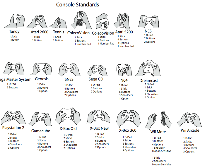
Some nice drawings of console and handheld consumer video game interfaces:

The full image can be found here (PDF, 580 KB), credited to Damien Lopez.
(via Pasta&Vinegar)
"After the mouse" meme creeping in
On 18, Dec 2008 | No Comments | In interfaces | By David Birnbaum
Vibrating puck reminds you to sit up straight
On 06, Dec 2008 | No Comments | In interfaces | By David Birnbaum
The iPosture is a small white disk that you stick somewhere on your body. When it senses that you’re sitting with bad posture for more than one minute, it reminds you with a buzz to straighten up. The website specifies that the tilt sensor has a resolution of three degrees.
This reminded me that during piano lessons as a young kid, when my teacher saw me slouch she would run her nail along my back to make me sit up. Which, if you think about it, is also a form of tactile feedback for posture correction.
(via Engadget)
Bringing surface relief to mobile touchscreens
On 01, Dec 2008 | No Comments | In interfaces | By David Birnbaum
invisual is an interesting design concept: a tactile screen cover bundled with accompanying software which together form a mobile computing solution for the visually impaired. The silicone screen cover displays tactile symbols and icons, and the software places buttons behind the surface features. Nice photos at the link.
(via Engadget)
Brainloop
On 12, Nov 2008 | No Comments | In interfaces | By David Birnbaum
Brainloop is a brain-computer interface that senses a user’s thoughts about motor commands (e.g., “move left hand”), and uses them to control software. The demo is beautiful and engaging simply because it shows a user controlling Google Earth. In past demos of brain-computer interfaces I’ve seen, the user is usually doing visually boring things like moving a cursor or surfing the web. Using the same type of input to control Google Earth makes it spectacular.
Note to self: when out to impress with a new input device, try to design the demo to include flying around the globe.
(via Smashing)
Automatically sync your music to your body
On 01, Sep 2008 | No Comments | In interfaces, music | By David Birnbaum
That’s what Yamaha’s BODiBEAT promises to do. More specifically, it syncs the tempo of your music to your gait. It’s been released as a workout tool, but it’s also an interesting musical interface as such, and if it works it will no doubt find its way into electronic music performance very soon.
(via Engadget)
Web interaction conceptual designs
On 09, Aug 2008 | No Comments | In gesture, interfaces | By David Birnbaum
Sterile gestural interface
On 20, Jun 2008 | No Comments | In interfaces, medical | By David Birnbaum
A great example of smart interaction design: touch-free gestural interfaces for hospital displays:
“A sterile human-machine interface is of supreme importance because it is the means by which the surgeon controls medical information, avoiding patient contamination, the operating room (OR) and the other surgeons.” This could replace touch screens now used in many hospital operating rooms which must be sealed to prevent accumulation or spreading of contaminants and requires smooth surfaces that must be thoroughly cleaned after each procedure — but sometimes aren’t.
Interesting sidenote: the fact that we associate touch with contagion in our culture is encoded in the words we use. Contagion literally means “with touch.”
Flexible, scalable tactile displays
On 12, Jun 2008 | No Comments | In interfaces | By David Birnbaum
An announcement of mechanotactile displays you can wear like a Band-Aid. The potential for clothing and contoured surfaces is massive. Reading the article the first time through I thought the display used electrical skin stimulation, but looking again I noticed this:
The display can convey information to the wearer when the electrodes induce a voltage across the films. A voltage causes the films to compress down and expand outward. In doing so, the films put pressure on the wearer’s skin, inducing a “mild sensation.”
I wonder how “mild” they’re talking about. The sensations that a tactile display can deliver has a lot to do with the depth of the sensory organs it can reach. From the press release I’m guessing the stimulator doesn’t displace all that much skin, meaning it can do tactile notifications and maybe even Braille, but not vibration or edge display. For the details we’ll have to wait for the next IEEE Transactions on Robotics.
(via Engadget)
Vibrotactile Braille wireless phone
On 11, Apr 2008 | No Comments | In interfaces | By David Birnbaum
A blind Japanese professor has prototyped a wireless phone with an integrated vibrating Braille display:
A former teacher at a school for the blind and a professor from Tsukuba University of Technology have developed a cell phone that sends out vibrations representing Braille symbols to enable people with sight and hearing difficulties to communicate… When a caller pushes numbers on the keypad corresponding to Braille symbols, two terminals attached to the receiver’s phone vibrate at a specific rate to create a message.
Japanese Braille uses six dots to represent the Japanese syllabary. Using the numbers 1, 2, 4, 5, 7 and 8, on cell phones to represent these six dots, it’s possible to form Braille symbols. The developers are now working to make the devices that convert keypad information into vibrations smaller than their current size (16 centimeters by 10 centimeters). If vibration-based Braille is applied more widely, it may enable information to be “broadcast” to several blind people at once.
The idea of representing one bit of Braille with one cell phone key has a certain elegance, but I’m not sure how useful it would be. Readers of Braille are used to using their fingertips, not their entire palms. On the other hand, the article is so vague that I might not even be understanding what they’re up to.
(via Engadget)
Vibrating Bluetooth mobile peripherals
On 08, Feb 2008 | No Comments | In interfaces | By Dave
Recently a friend lamented the uselessness of vibration feedback for females, who tend to carry their mobile devices in a handbag rather than a pocket. Solution: a fashionable vibrating Bluetooth bracelet. The company that designed it also offers the gadget in a wristwatch form factor.
[via Boing Boing.]
UPDATE: Aformentioned friend notes that the bracelet is not, in fact, fashionable. My mistake!

